

I have a lot of great comics on my pull list at the moment, but few have me quite as enamoured as Jem and the Holograms by Kelly Thompson and Sophie Campbell. Usually, I’m content to wait however many weeks it takes for my orders to arrive in New Zealand, and with many books, I’ll wait until I have two or three issues to read in one go.
With Jem, there’s none of that. I started reading it on Comixology, decided I liked it enough to justify paying extra for physical issues, then got a digital sub anyway because I’m too impatient to wait for the physical ones to arrive. I’ll download a new issue the minute it’s available on Comixology (subscription notification emails are wonderful), and you can bet that’s a moment I’ll have been looking forward to all week. A paperback of the first arc (issues #1-6) is due out next month, and you know I’ll be getting that as well. Maybe even two – one for me, and one to lend to anyone and everyone who’ll listen.
So yeah, you could say that I rather like Jem and the Holograms. Here are ten reasons why.
1. Joyfulness is at its core
 It’s easy to find comics that are exciting, action-packed, funny, or thought provoking, often all at the same time, but books that inspire joy, rather than just enjoyment, are harder to find in the sea of action, adventure, and “gritty” violence. In Jem, joyfulness is central. Reading it isn’t just about being entertained by a great story or admiring great art; every issue has me filled with happiness from start to finish.
This isn’t a coincidence. Everything, from the almost exaggeratedly bright colours (M. Victoria Robado, the colourist, is phenomenal), to the fun, poppy character designs, to a story that has friendship and love – both platonic and romantic – as fundamental themes creates this sense of unadulterated exuberance. This doesn’t mean there’s no conflict or drama, because there is plenty of that, but it’s always underscored by positivity.
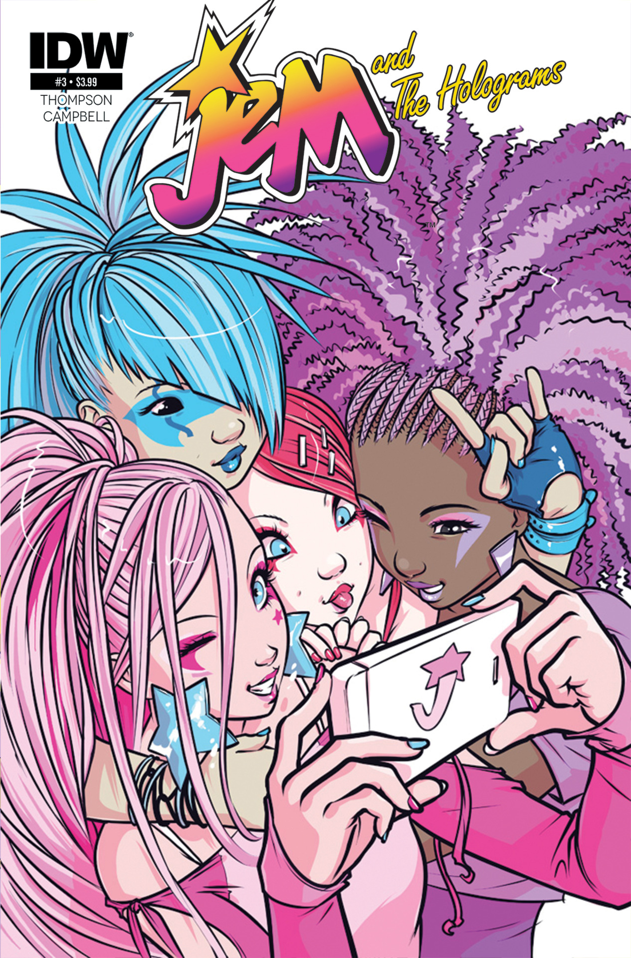
2. Character designs are wonderfully diverse
Jem and the Holograms is a reboot, which means all new character designs, and they are just wonderful. The original cartoon is beloved and praised for its centering and portrayal of women, but it’s also a product of its time. There are a few people of colour, at least, but body diversity and queerness are non-existent. Everyone is thin, and straight (or at least, assumed to be straight, because in our society, that’s seen as the default).
In Thompson and Campbell’s Jem, people range from slim to fat, or thick, or curvy, or whatever your choice of fat-positive terminology is. More importantly, they’re not there to be the butt of any jokes. They’re not dehumanised. None of them are “the fat chick”. They simply exist, with their body as one of many facets of their character (and not narratively significant one, at all). It’s kind of sad that in 2015, fat people being represented with dignity in the media is still noteworthy and “progressive”, but there you go.
And then there are Kimber and Stormer, who are queer, and are one of the most adorable couples of I’ve ever seen, in any medium (including real life!) Their romance is a significant part of the story, but it’s not because they’re two women dating, but because they’re from rival bands. There’s no big “coming out” plotline; they’re just queer women in a world that accepts that.
That’s what’s really great about the diversity in Jem. It’s inconsequential within the world that Thompson and Campbell have created, which makes it so, so important when creators still seem to need some sort of reason to broaden their representation. Like Comics Alliance’s Andrew Wheeler said, “gay characters [and characters of any sort of under-represented group] aren’t going to show up ‘organically’ in your stories, you have to put them there.”

3. The adaptation of music to a comic format is genius
 In a story about music, an aural component is important. How do you capture that in a comic, when the only way to create sound is to invoke the reader’s imagination? With very clever use of composition, art, and lettering, that’s how.
Performance scenes in Jem use full-page spreads, with lyrics written in flowing, wispy speech “bubbles” spanning the whole composition. The layout is more abstract, not strictly sticking to a panel-by-panel progression (except in one notable case in issue #5, which is a masterfully crafted montage). The colours used, the imagery on stage, and the lettering all combine to let you “hear” the music, even though it’s not playing.
The Holograms’ music is more happy and poppy (in my mind, they have a real Carly Rae Jepsen vibe), coming through in the heavy use of pink and blue, and the “smokey” style of the lyric ribbons. For the Misfits, green, yellow, and purple give off a darker tone that, coupled with the very angular, rigid lettering and ribbons, create a sound that’s more raw, something more punk or metal. Obviously, the writing and design of the characters offer a lot of support, too.
4. The characterisation is spot on
Characters tell stories. The most basic, straightforward plot can be captivating with the right people at the heart of it, and even deep, intricate plot will fall flat if there’s nobody to make you care.
Jem and the Holograms has characterisation in spades, and then some. From their performing outfits and make-up, to body language, to the way they interact with one another, each character’s personality jumps right off the pages. They all fit neatly into archetypes – Jerrica’s the shy one, Kimber’s the carefree one, Rio’s the charming one, and so on – but there’s a sense of authenticity that subverts those and prevents them from becoming tired cliches.
These are characters that I feel like I know. I can relate to them and empathise with them. I care about what happens to them. I get uncontrollably giddy when Kimber and Stormer kiss. I have an honest-to-goodness crush on Kimber, that’s how believable and likeable these women are.

5. The artwork is beautiful
The art in Jem is, hands down, some of my favourite I’ve seen in a comic. The character designs are so creative and interesting and gorgeous, and Robado’s bright colours bring them to life like nothing else. The linework is thick and smooth, complementing the use of blocks of solid colour with relatively minimal shading, giving the whole book a clean, cartoony look that works so perfectly with the tone and theme of the story, and is utterly delightful to look at. Of course, all of the above points tie into this, too. The diversity, the joyfulness, and the sense of character are all major factors in Jem being as gorgeous as it is, of course.
It’s not unusual to look at comic book covers and see something that would look good as a frame print on the wall. With Jem, I get that same feeling from the interiors.

6. Kimber and Stormer
Kimber and Stormer are just the absolute cutest, and I kind of can’t deal with it. It’s hard to even capture in words how wonderful there relationship is, so I’ll let the book speak for itself with this, quite possibly the greatest single page of any comic ever:

In short, Jem and the Holograms is a wonderful, beautiful book that I can’t recommend highly enough. Read it, then hit me on Twitter to talk about ships and share tales of Kimber thirst.